Dieser Beitrag ist auch verfügbar auf:
intervals.icu can do a lot — it’s just that the interface looks like it was built for data, not for checking in every day. My training is planned elsewhere anyway, through an AI assistant; for me, intervals.icu mainly manages the data and pushes the workouts to my watch. So I packed the features I actually need daily into my own tool: “Loop UI.” A single HTML file, my plan in magazine style, live-connected to the real account — plus a few analyses that don’t exist anywhere else.
Note: loop isn’t a product you can buy or download — it’s a private hobby project for my own plan, behind a password. So this article isn’t a review to go shop for, but a workshop report … ;)
Loop UI
Type
Self-built — a standalone HTML file, also runs offline
Base
intervals.icu as the data hub, live via the API
Access
Locally by double-click — or online, even from a phone
Loop UI: a self-built browser interface for my own intervals.icu plan, made for data-loving hobby runners. Not a product to buy, but a private tool — able to run offline, though for me it’s reachable online too, even on mobile. Five views, from the weekly cockpit to the season overview, plus an HRV analysis based on Plews that doesn’t exist anywhere else. Anyone who’d rather read their plan than manage it will get the appeal right away.
Why build a custom interface at all?
intervals.icu is a Swiss Army knife — powerful, dense, a bit technical. The calendar shows everything, but it doesn’t exactly invite you to just glance at it over morning coffee. That’s exactly what I wanted though: a tool I’d actually enjoy opening … not one I have to work my way through.
On top of that: my training isn’t even planned in intervals.icu — it’s planned through an AI assistant (Claude). For me, intervals.icu is the data hub — it stores, evaluates, and pushes the workouts to my watch. Whatever I actually need to see day-to-day, I’ve gradually pulled together into loop.
- loop is a plain browser file. It runs by double-click — completely offline, no server, no installation.
- So I can reach it from anywhere, even on my phone, I’ve also made it available online for myself — behind a password.
- It connects live to the real intervals.icu account. Moving, deleting, and creating things take effect immediately in the account — so loop isn’t a copy, but a second door to the same plan.
The Cockpit — my week at a glance
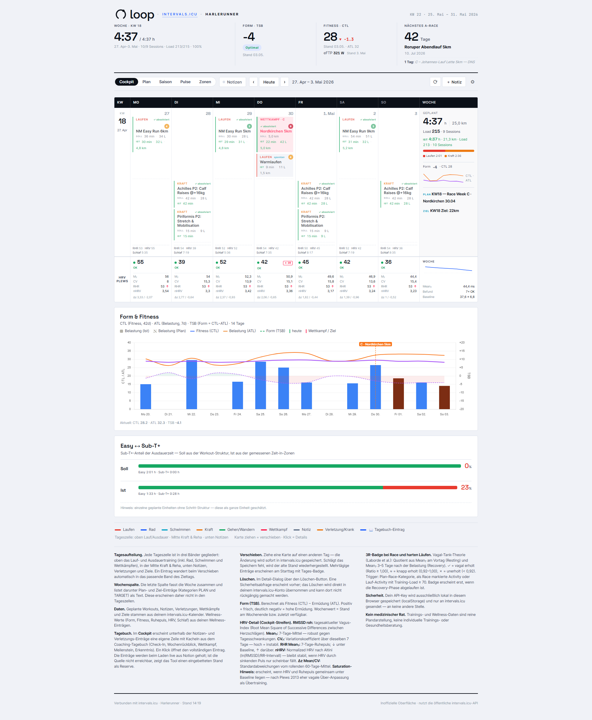
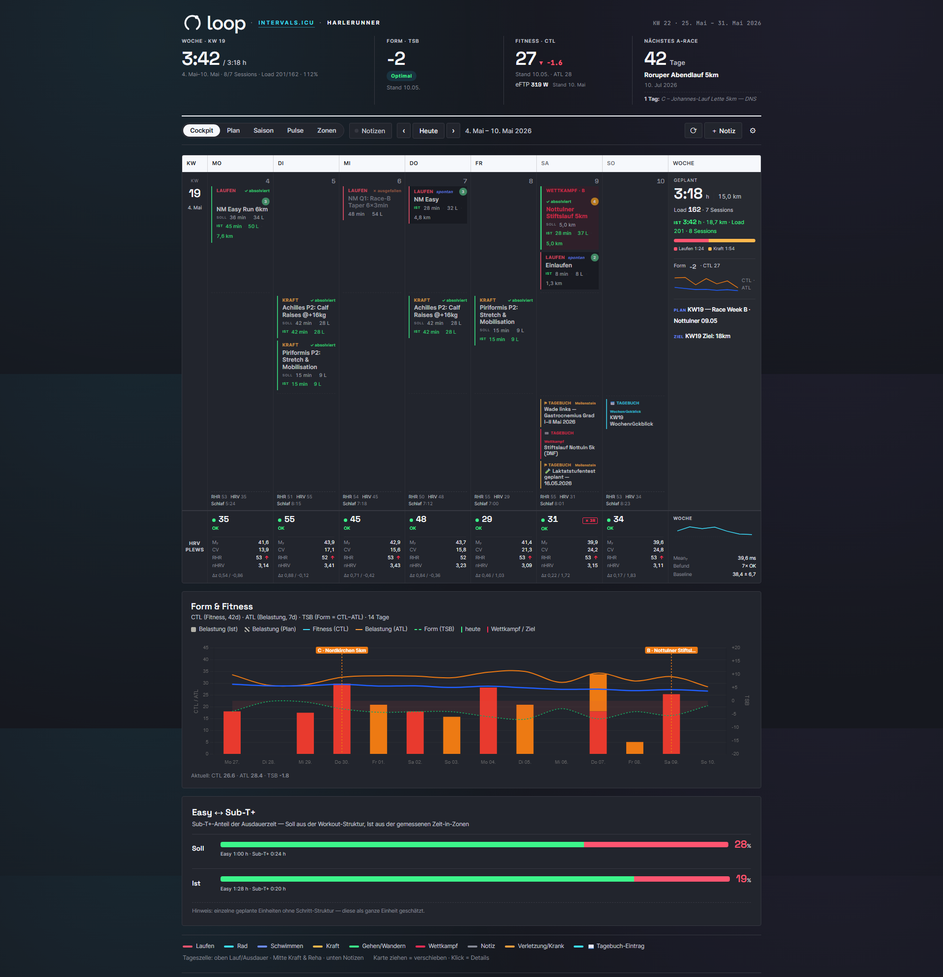
The cockpit is the view I open most often. A single week, but with everything I want to know in the morning: Am I fresh? What’s coming up? Where is my form heading?
The weekly grid sorts the days into three bands — running and endurance on top, strength and rehab in the middle, notes at the bottom. Below that sit the HRV strip, a “Form & Fitness” panel with the CTL/ATL/TSB history, and the Easy/Sub-T+ breakdown for the week.
- The hero strip at the very top shows planned hours, form (TSB), fitness (CTL) including eFTP, and the next A race.
- Form, fitness, and eFTP values follow whichever week you’re browsing back to — so historical views match the state at that point in time.
- A daily wellness footer adds resting heart rate, HRV, and sleep duration.
What this gives me as a runner: an honest morning check in five seconds. No searching, no scrolling — everything I want to know about the current week is just there.
HRV per Plews — the most honest early warning
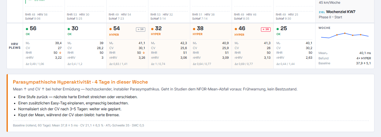
This is the part I’m proudest of. For every day of the week, loop shows an HRV assessment based on Daniel Plews’ method — enriched with a few newer research findings. The basis is the daily RMSSD and resting-heart-rate values I measure via HRV4Training and sync from there to intervals.icu.
- Each day produces a rolling 7-day average and a coefficient of variation, compared against a 60-day baseline.
- From that comes a signal: OK, NFOR (fatigue), HYPER, or SAT? (vagal over-adaptation rather than overtraining).
- A 3R badge (Vagal Tank) checks after races and hard days whether recovery has returned.
- On critical days, a warning banner appears with the meaning and a recommendation.
This analysis — the Plews quadrant along with the 3R recovery check — doesn’t exist like this in intervals.icu or in any other tool I know of. For this one piece alone, the whole effort was almost worth it.
What this gives me as a runner: I see a looming crash before it becomes an infection or an injury. It’s no oracle, and definitely not medical advice — but as an early warning system that thinks along over the weeks, it’s worth gold. One thing matters here: Plews relies on clean HRV history, measured every morning under the same conditions. Without that, the display is only half as honest …
Had I already had this analysis at the start of the year (the screenshot is from that time), I might have avoided my overuse injuries. What I was doing back then was pretty reckless. My previous warning systems (just the HRV trend) didn’t fire at all — Plews, by contrast, flagged it clearly.
Plan, season, pulse — the view forward and back
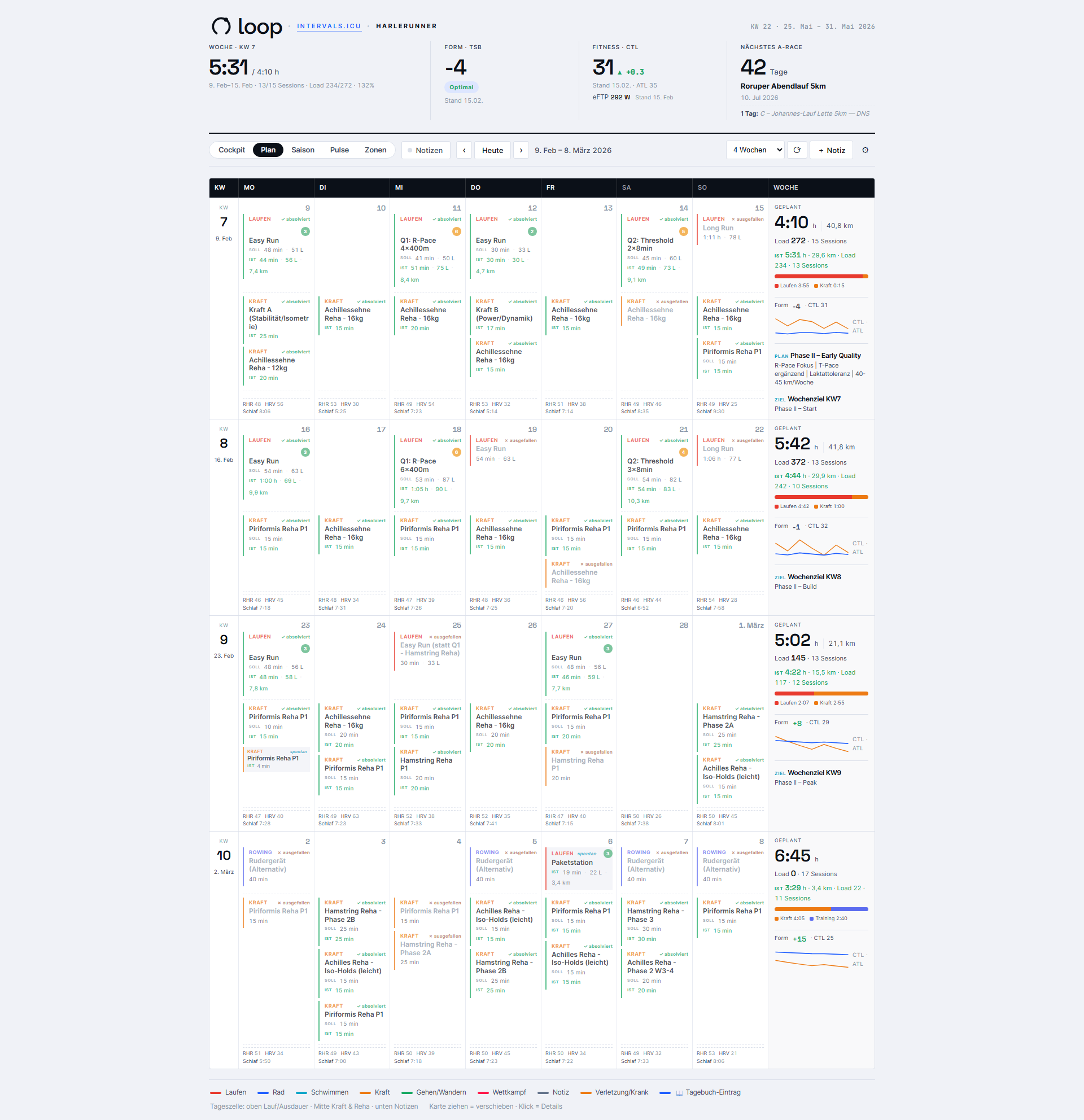
Same training, three altitudes. Depending on whether I’m fine-tuning next week or want to see a whole quarter, I switch views — the time window stays the same throughout.
- Plan — the multi-week grid over 4/8/12/16 weeks, with a full weekly summary.
- Season — a compact table, one row per week, with phase and Sub-T+ share (planned vs. actual). Strength training is deliberately hidden here to keep the endurance focus.
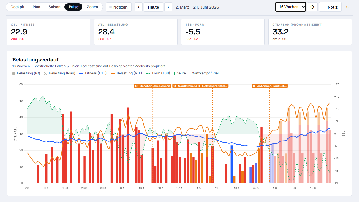
- Pulse — the load and form history over 4 to 52 weeks, with load bars color-coded by sport and CTL/ATL lines.
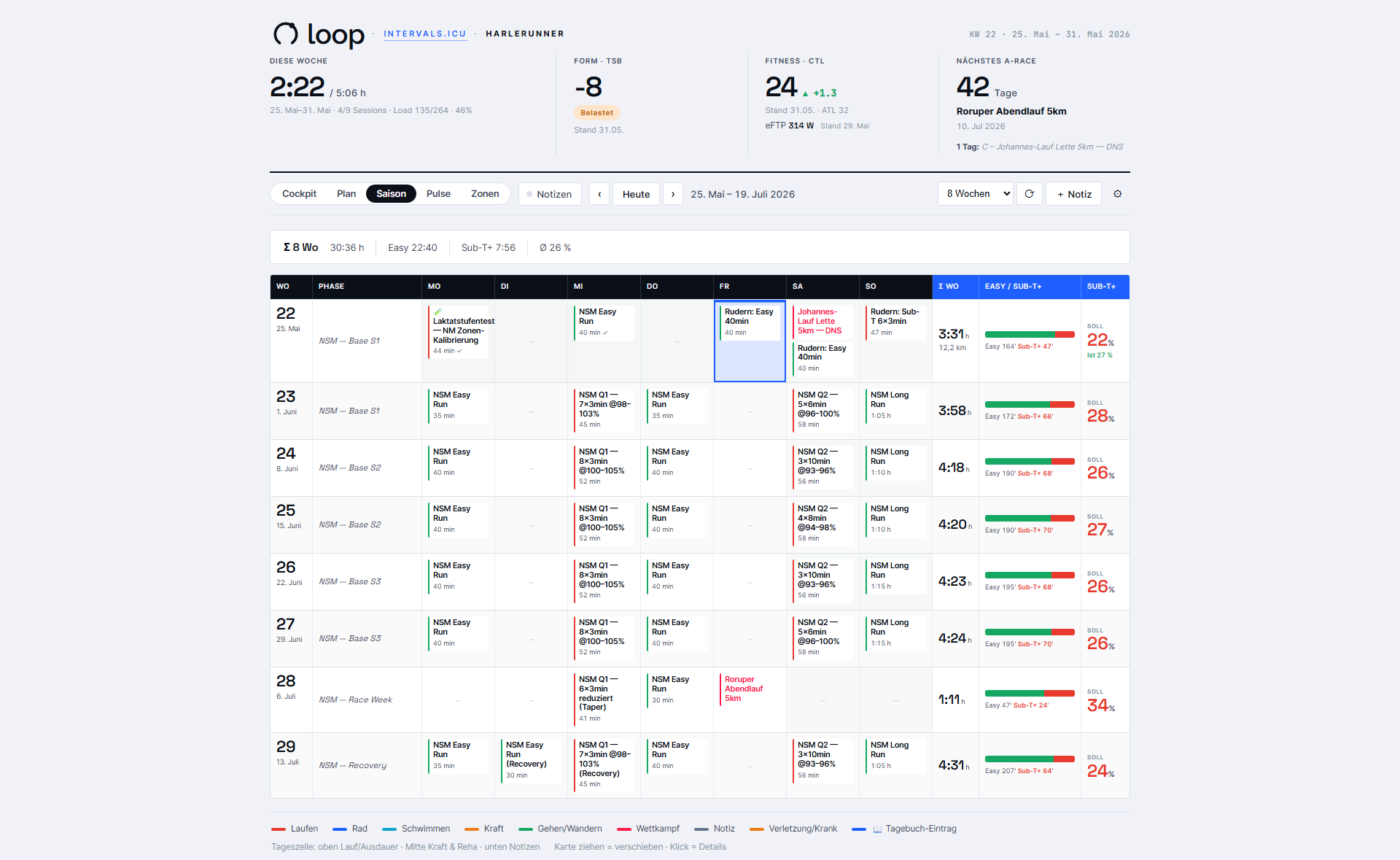
What this gives me as a runner: I can zoom. Sometimes the week, sometimes the season, sometimes half a year — and I can see right away whether the plan fits or needs adjusting somewhere.
Planned vs. actual — did I hit the plan?
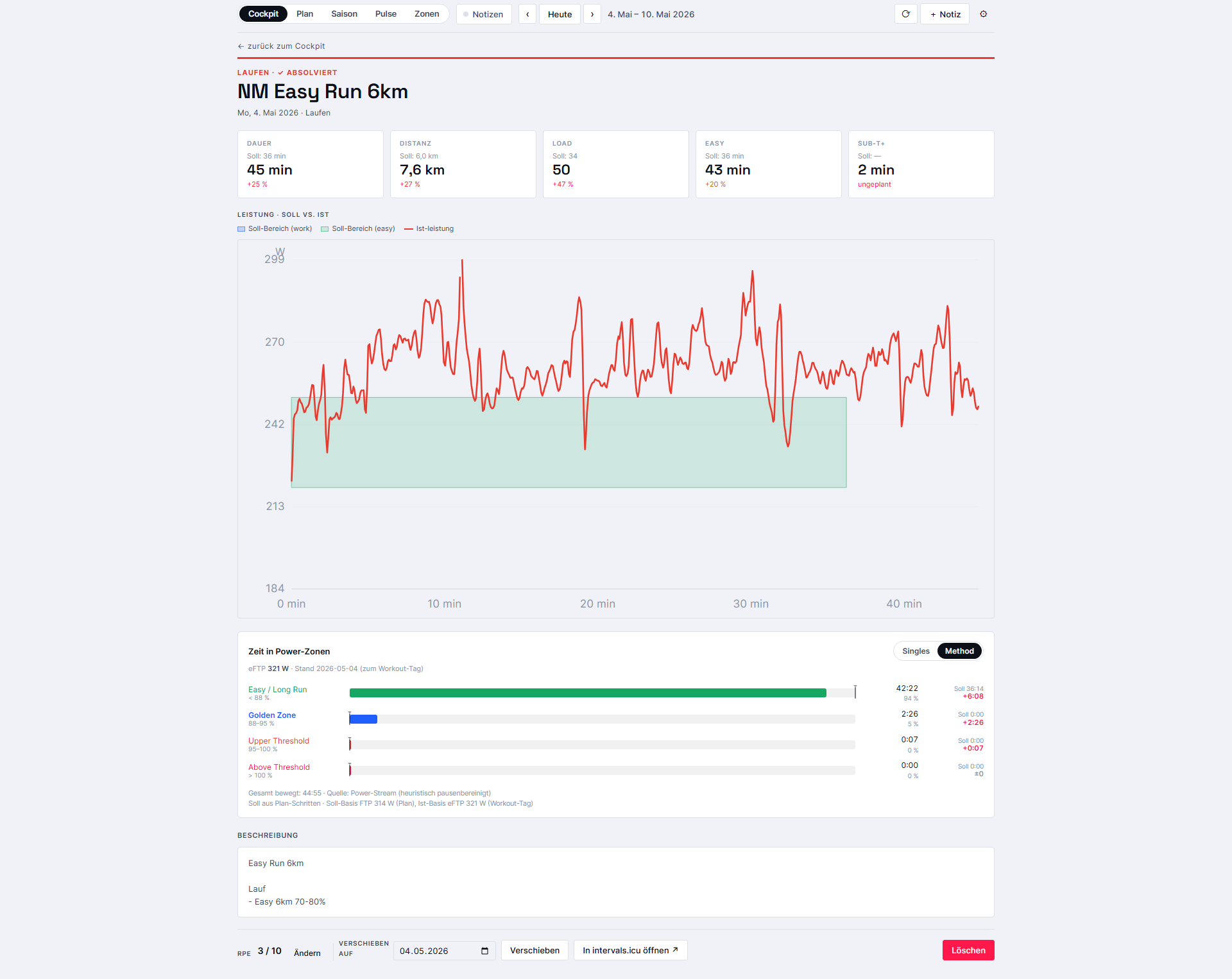
A plan is one thing, reality another. loop puts both side by side and assigns each session a status: completed, missed, open, or spontaneous. Clicking a tile opens a full-screen detail view.
- Stat tiles show duration, distance, load, and Easy/Sub-T+ as planned vs. actual — color-coded by plan adherence (green, yellow, red).
- The compliance graph overlays the target bands for each workout step onto the line actually run (power, pace, or heart rate). Pauses are filtered out.
- For running sessions with power data, a bar shows time spent in each power zone.
- RPE can be entered directly in the detail view via 1–10 buttons.
What this gives me as a runner: honest feedback instead of a simple checkmark. Not “done,” but “hit — or not.” That’s exactly what helps for next time.
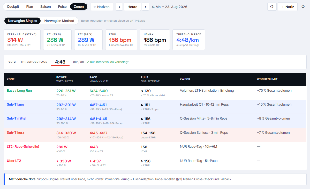
Zones per Norwegian Singles and Norwegian Method
Since I currently train using the Norwegian Singles Method, a clean zone reference is part of the deal. loop derives it from the current eFTP and the sport settings — and it covers both camps.
- Norwegian Singles — six zones with power (watts + % eFTP), pace, heart rate, purpose, and weekly limit.
- Norwegian Method — four zones including lactate values, with the Golden Zone highlighted.
- The vLT2 threshold pace is editable and pre-filled from the intervals.icu settings — all pace columns recalculate live.
What this gives me as a runner: my actual training zones always within reach, in the same system I run by. No switching to another app, no converting in my head.
Seven themes, because it’s just fun
A bit of fun has to be part of it … ;) loop comes with seven switchable themes — six light ones and one dark “Neon.” Among them are variants inspired by tools like Strava, TrainingPeaks, or Athletica.
That may sound like a gimmick, but it has a practical core: the interface feels familiar because it looks like the tools I already know. And planning in the morning in the dark Neon theme is simply nicer than a plain calendar.
What does this really give me as a runner?
Two things. First, loop arranges the existing data the way I actually think about my training — which lowers the barrier to even looking at it. Second, it contains real analysis that intervals.icu doesn’t provide, above all the HRV early-warning system based on Plews.
The cockpit in the morning, the plan and season views for planning, the HRV strip and compliance graph when in doubt. Three or four clicks, and I know where I stand. The fact that loop runs offline but is also available online for me means the view of my week is never further away than my phone. And the fact that everything writes straight to the real account makes it convenient — and a little dangerous, since deleting can’t be undone.
My take:
loop will never be a finished product, and that’s a good thing. It’s tailored exactly to me, my plan, and my quirks — someone else would get little out of it. But for me, this little side project has been more than worth it.
At the same time, building it with AI has been a lot of fun — and still is. I can wish for any feature and the AI takes care of implementing it. Even the last small tweaks came about while I was writing this very article.
Along the way, I learned more about the logic of my own training than most tools ever taught me before. And the habit of opening loop in the morning instead of the bare calendar … that’s just more fun. :)
New: Loop UI Download
In response to popular demand, I’ve now made the current version (09-2026) of my intervals.icu interface available for you to try out or download. I’ve removed all personal references and links, so you won’t have access to 100% of the features I’ve developed. However, this mainly affects the integration with my training log in Notion.
https://harlerunner.de/loop/loop-de.html
I think a lot of it is well explained, but there’s certainly plenty more to discover that I haven’t covered in this article yet. 😉 Loop UI is in German, so you’ll have to take care of the English translation yourself. If you have any questions, feel free to reach out to me.

Autor und Betreiber von Harlerunner.de. Läufer seit mehr als zehn Jahren, über 100 Wettkämpfe von 5 km bis Halbmarathon im Gepäck, bisher mehr als 500 Produkte getestet. Kein Labortest — alles kommt aus dem echten Training in und um Coesfeld. Was du hier liest, hat er selbst an den Füßen, am Körper, am Handgelenk oder im Ohr gehabt.
Author and owner of Harlerunner.de. A runner for over ten years, with more than 100 races under his belt – ranging from 5 km to half-marathons – and having tested over 500 products to date. No lab tests – everything is based on real-world training in and around Coesfeld. Everything you read here is something he has personally worn on his feet, on his body, on his wrist or in his ear.