Dieser Beitrag ist auch verfügbar auf:
I have never been too impressed by manufacturer portals – neither by their design nor their functionality. Therefore, my data is also (manufacturer-independent) at TrainingPeaks. But what Stryd now offers with its new PowerCenter is quite remarkable.
Inhalt / Content
Stryd PowerCenter
Stryd apparently has a pretty strong development department. Not only the hardware and its firmware are considered, but also the apps and Garmin data fields. Unfortunately I don’t have an Apple Watch, because they seem to be especially active on that platform.
Even the old PowerCenter already brought some useful advantages. In practical terms, the most important one was the ability to merge Polar or Suunto recordings with the Stryd’s offline sync. This is the only way to get a file that really contains all the metrics of the run. With Garmin, this is not necessary, as everything is already stored in the fit file via the Connect IQ data field.
The new PowerCenter continues to do this, just as it does to determine training stress or assess the distribution of training intensities. What else the new PowerCenter can do and what you should be aware of is coming now. ;)
Profile
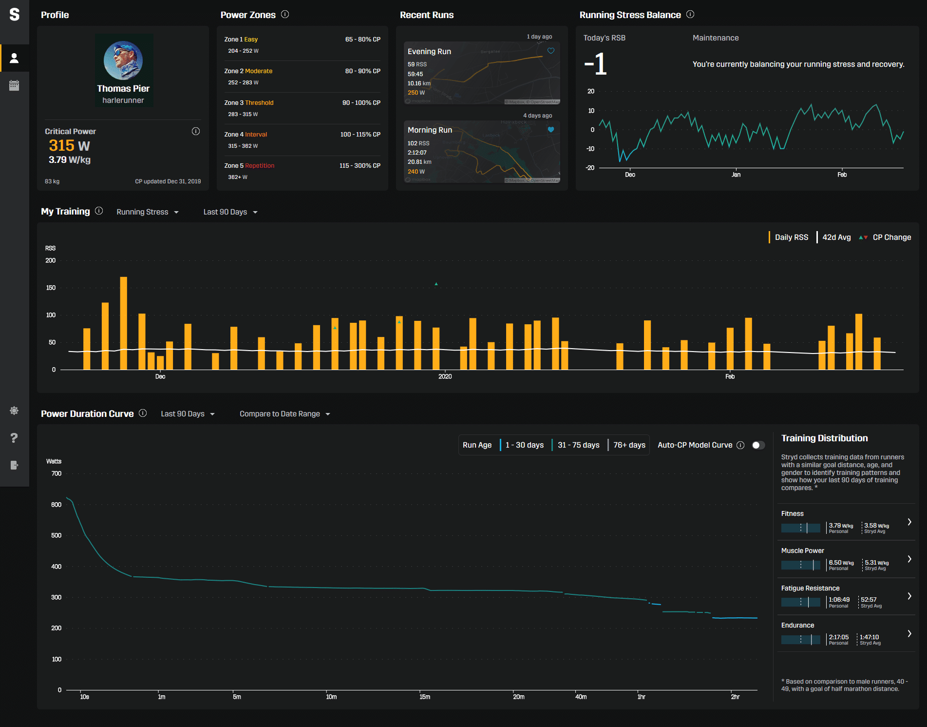
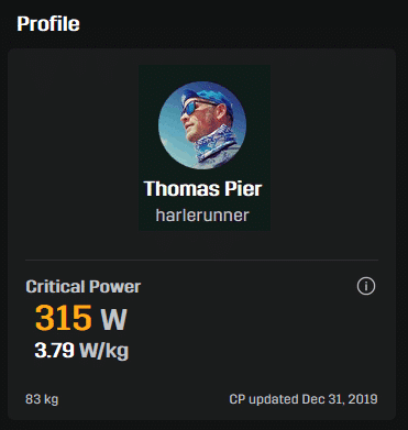
The PowerCenter is built in tiles and starts with the profile in the upper left corner. You can place a profile picture here, see your name and user name – but the most important information is the Critical Power. It is given as an absolute value and in watts per kilogram. So you can compare your power-to-weight ratio with other athletes. The stored weight and the last time the Critical Power was updated is shown below for reference.
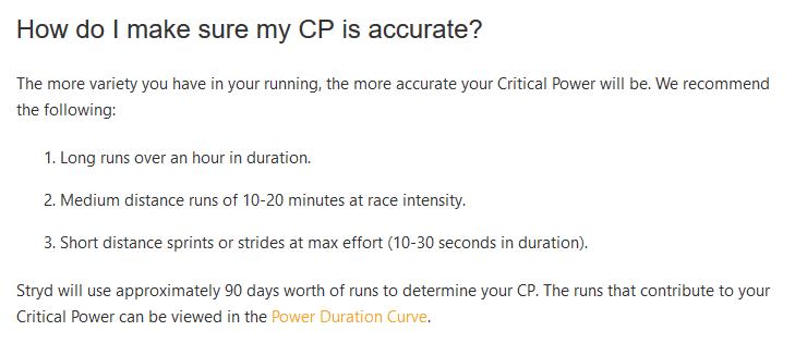
The small “i” symbol allows you to call up additional information from Stryd Support. For the Critical Power you will learn here that the computational model is mainly fed by the long runs (more than one hour), tempo runs in competition speed (10-20 minutes) and maximum sprints (10-30 seconds). The auto-calculation always considers the last 90 days.
Power Zones
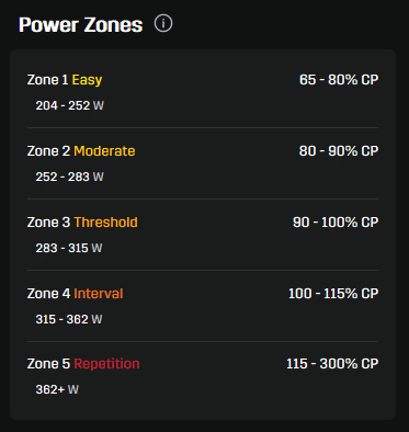
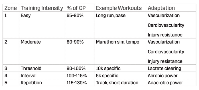
The next tile translates the critical power into training areas. The system consists of five zones and is (in my opinion) quite rough. They seem to have looked at even percentages rather than at existing systems of renowned trainers (a good overview can be found here).
Ultimately, there is no right or wrong with such systems – they just have to match the training plan or the training sessions used there. However, since the Stryd zones are also synchronized with data fields on Garmin watches, you should be aware that they may differ from the specifications of a non-stryd training plan. For example, my defaults from Michael Arend’s training plan for zone 4 are a good 5% below the Stryd defaults.
Recent Runs
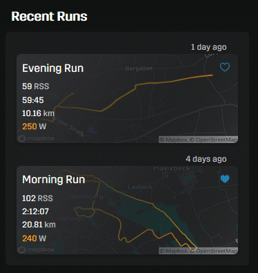
The last two runs are directly accessible in a separate tile. Besides some core metrics, the GPS track is visible in the background, which helps me a lot to recognize the runs. Because if you don’t bother to assign names manually, this information remains very meaningless.
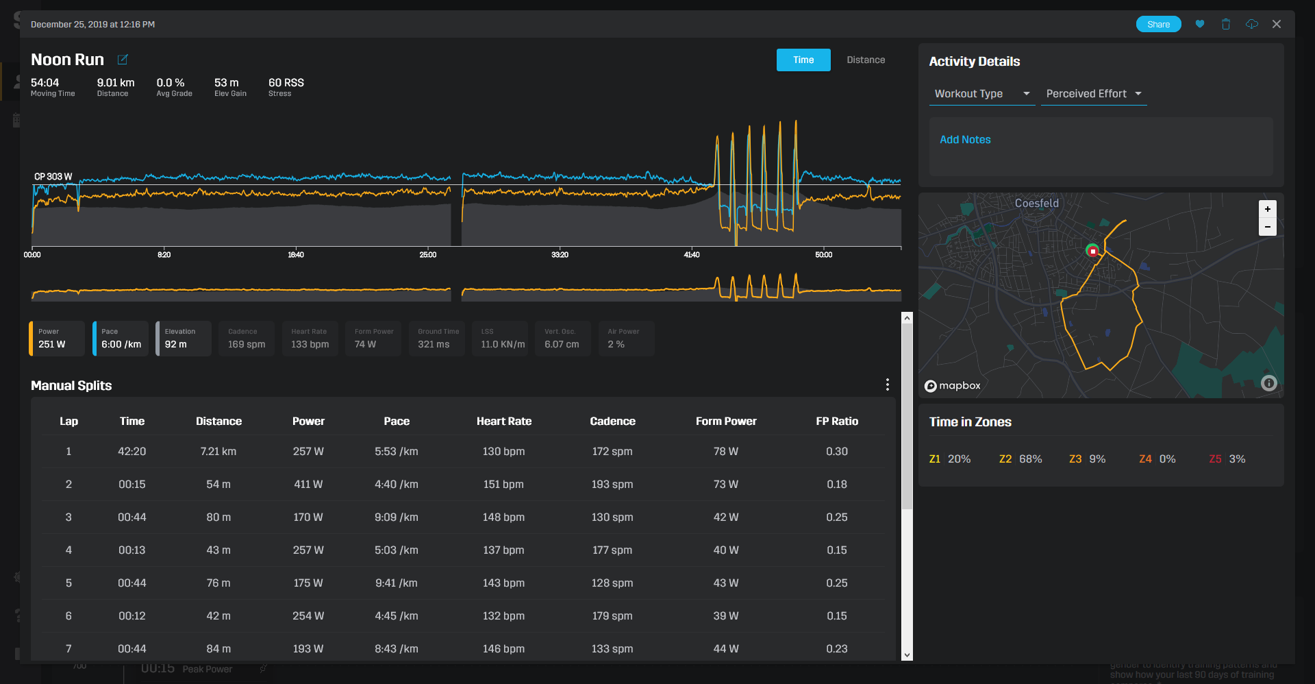
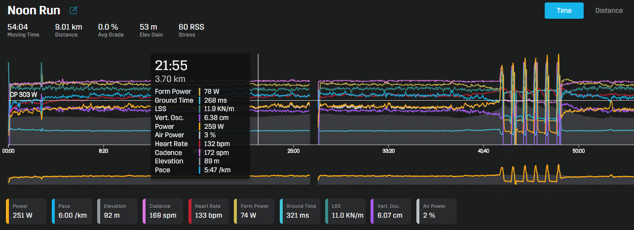
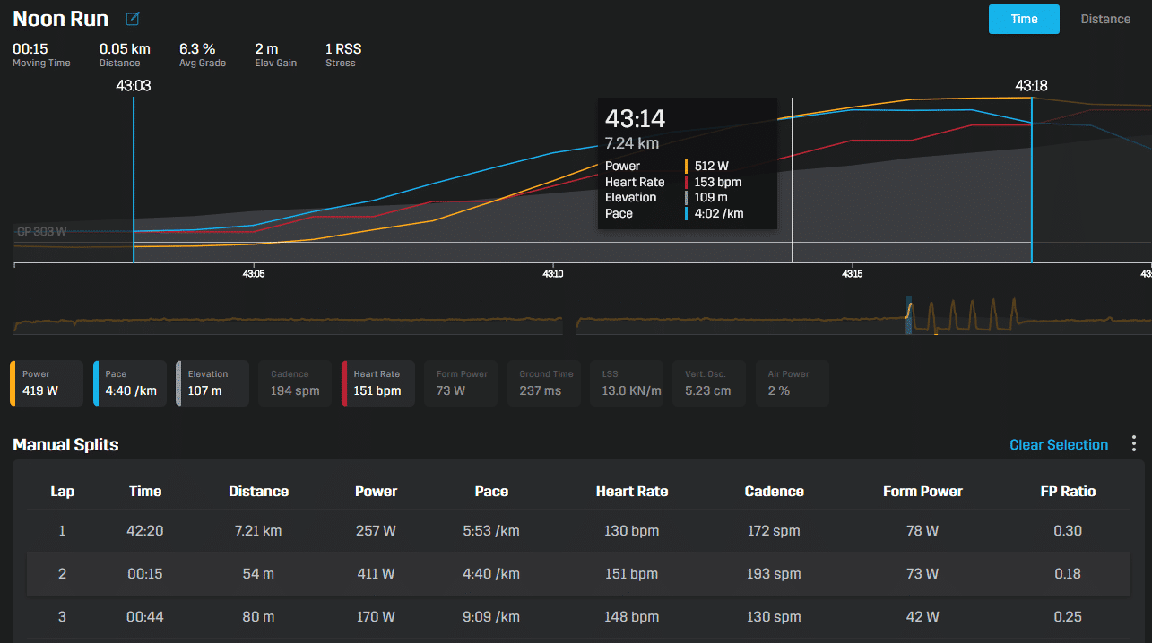
A click will then open the detailed page of the run. It starts with the graphical display of the recorded metrics over time or distance. The buttons below the graphs each show the average value of the displayed range. By clicking here, metrics can be added or excluded from the display.
The exact measured value for each point of the curve is shown by an overlay, the position of which is controlled with the mouse. You can also define a section ( drag a window) that you want to view in more detail.
Below the graphs there is a table showing the values according to manual lap recording or kilometer splits. The selection of a line leads to a section in the graphs here as well.
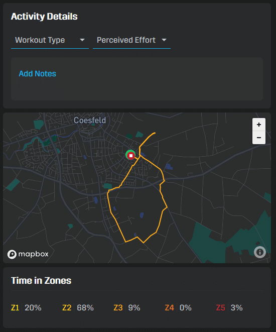
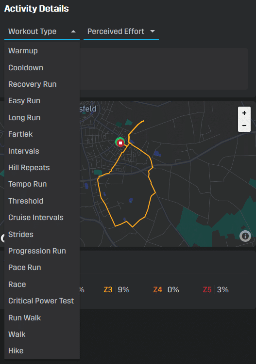
To the right of it are details of the activity. Here you can specify the type of training, store your RPE and notes.
By the way, the map display below reacts to the selection of sections. Finally, you get a row with the percentage distribution of the training time across the five power zones.
Calendar
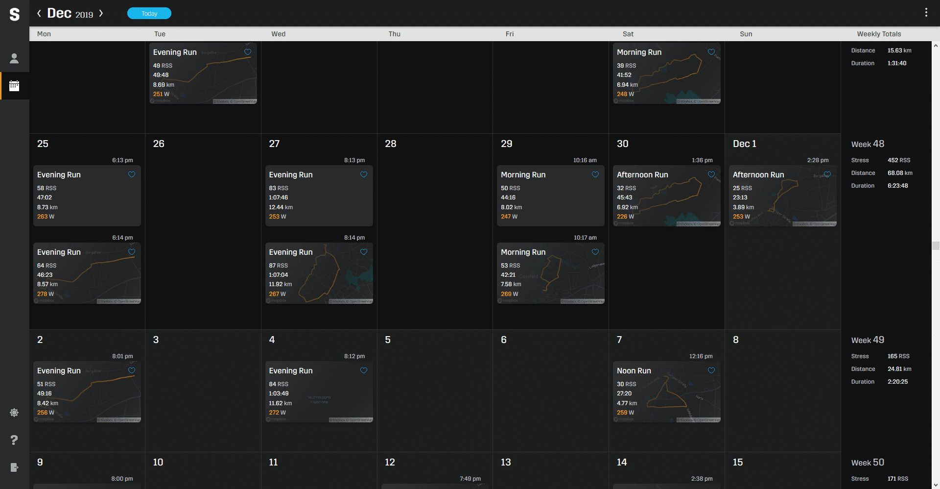
An overview of all runs can be found in the calendar, which can be accessed via the icon in the left sidebar. At the end of each week row, stress, distance and time are summed up for a better overview.
Almost forgot: at the top right you can also share the run with other PowerCenter users (!), mark it with a heart, delete it or download it.
Running Stress Balance
Speaking of stress: there are different approaches to determine a stress score from the duration and intensity of a run (Trimp, TSS, Session-RPE, …). Stryd has decided on his “own” formula and calls the result Running Stress Score or RSS.
The formula is: RSS = 100 x training duration x (Power/CP)^K
The value therefore depends on the training duration, the produced power in relation to the critical power (=intensity) and a factor “K”. What exactly is behind “K” I could not work out. But the coefficient is supposed to reflect that the stress of running is higher than that of cycling – where the basic formula comes from. Nevertheless, my RSS values are always 10-20% lower than the TSS in TrainingPeaks (if CP and FTP match, of course).
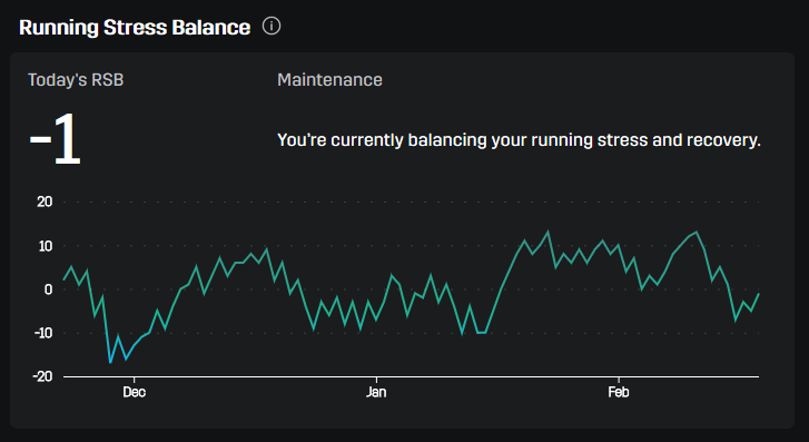
In the Stryd PowerCenter you will find the corresponding Running Stress Balance RSB in the upper right corner. This describes the ratio of current training stress (7 days, weighted average) to long-term stress (42 days, weighted average). However, you have to learn to read the curve first, because exceptionally, higher is not necessarily better.
The productive range lies for Stryd between -10 and -25 – for weeks of training. This naturally includes the subsequent recovery. So it is not the aim to keep the curve within a certain range for as long as possible. You should only enter the dangerous areas (from -25) for good reason, while values above +5 should only appear in the tapering phase before a competition.
My Training
By default, this section displays the last 90 days of Running Stress, along with a 42-day trend line and critical power change markers. This way you can view the history of your CP – until now this was only possible in the IOS app.
Alternatively, this diagram can also show the elapsed time, distance or elevation – also for other periods of time.
Power Duration Curve
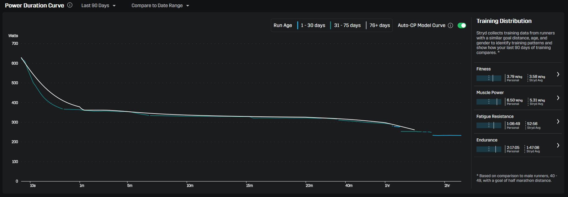
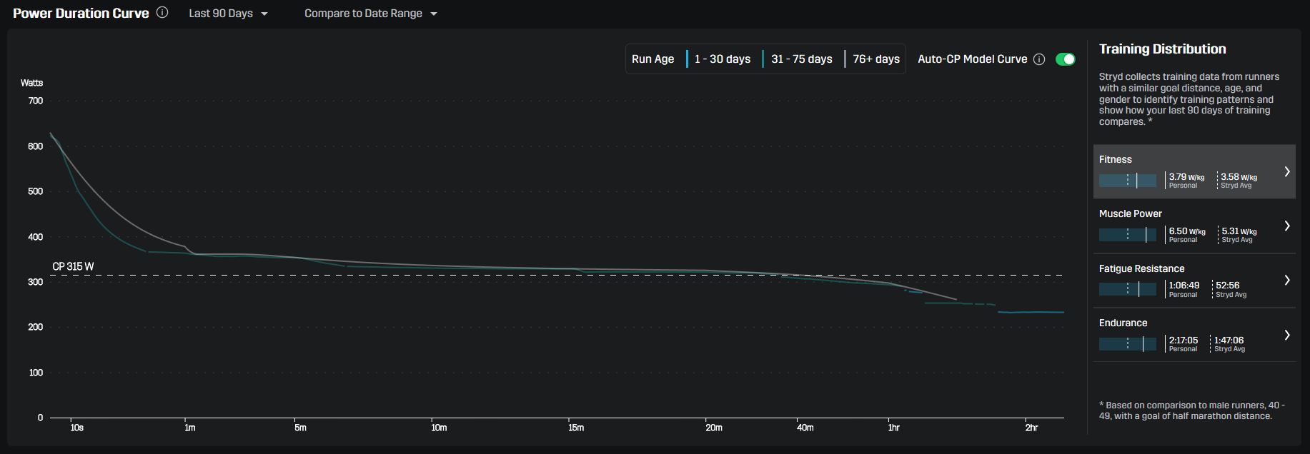
The Power Duration Curve is certainly the heart of the new PowerCenter. What has long been known to WKO and Golden Cheetah users is now being presented to pure Stryd users. The power duration curve is your best effort power (in Watts) at any given duration (up to five hours) that you’ve done over the defined period of time.
These maximum values are smoothed under a curve. This calculated PDC also weights the underlying data according to their age: runs of the last 30 days are fully counted, after which the influence fades with time. Blue curve components are thus current, green ones are still OK (but already more than a month old) and grey ones will soon be dropped from the calculation.
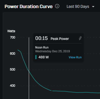
A very exciting feature is that for each section on the curve, you can determine which run provided the data for it. The other manufacturers have not yet come up with the idea – yet this can be so helpful (see data hygiene)!
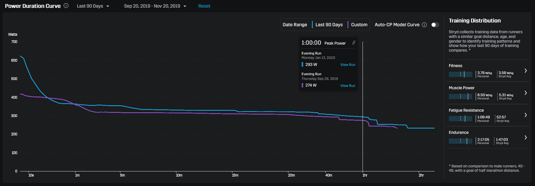
It is also possible to compare different periods of time. For example, you can superimpose the current Power Duration Curve with the Power Duration Curve for the period of the 90 days before. As it seems, my 1 hour power has improved by almost 20 watts. ;)
Data hygiene
The Power Duration Curve can only be as good as the data on which it is based. “Garbage in – Garbage out” is the motto. You should therefore keep a close eye on whether all runs are really recorded in the PowerCenter (or whether there are even duplicates) and whether they contain erroneous data (spikes).
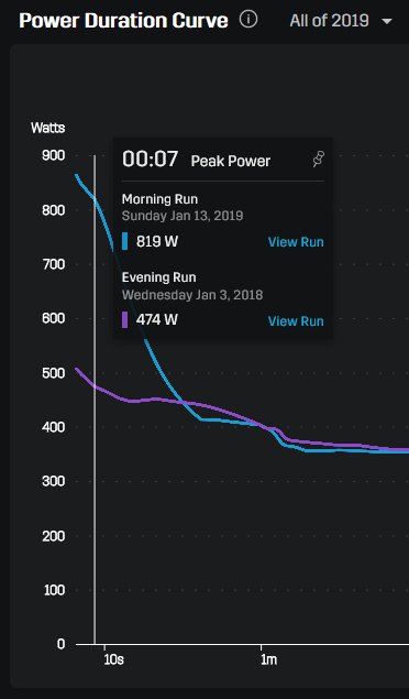
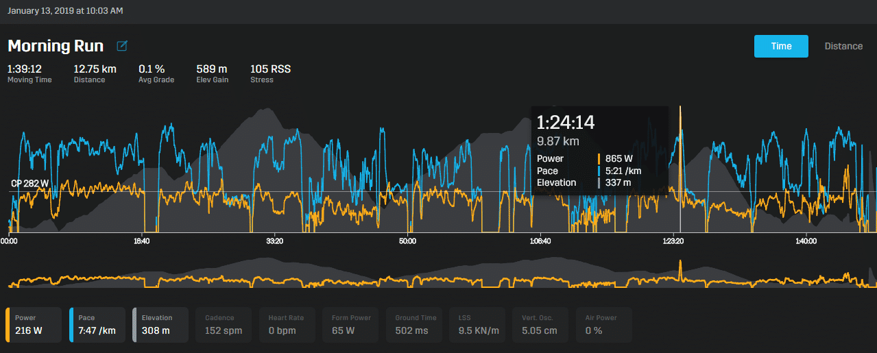
Extreme data spikes are relatively easy to recognize by an extreme start of the power duration curve at 1 second. In this example, a run from 13. January 2019 is responsible.
At 1:24h there is a power peak, which certainly does not belong there and ultimately represents a measurement error. Unfortunately, although this can be identified in the PowerCenter, it cannot be changed. The editing tools are missing to remove such peaks. The only option at the moment would be to export the run, then delete it and upload a modified file (using the Peak Remover of the FitFileTools for example).
Second example: Here, the run on 6. August 2018 is the cause of an unusual PDC. Unfortunately, this file is not really usable: the table only contains zero values, while the power graph shows that it probably consists only of measurement errors. The only possibility here is to delete the whole file and thus remove it from the PDC calculation.
So it’s worth taking a very close look at the data quality of the PowerCenter. At least for the identification and removal of partially unavoidable spikes (stumbling, …) I expect Stryd to provide its own tools on the platform. According to discussions in the Facebook group this is already on the agenda.
Training Distribution
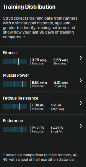
To the right of the Power Duration Curve is information on the distribution of training intensities to date. In the old PowerCenter, this was a triangle graph showing the distribution of three factors. Now four areas are examined and compared with the average of Stryd users of the same age who have the same training goal (!). The basis for this is that such a goal (10 km, half marathon, marathon, …) is defined in the Stryd app.
It starts with the fitness based on Critical Power. If you click on the area on the right, you will see on the left what it refers to. So the Critical Power is displayed for the Fitness.
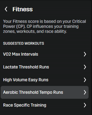
At the same time, workouts are suggested (and described with a further click) that are useful for further fitness development.
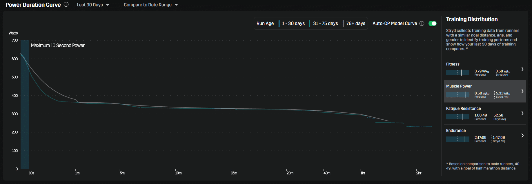
We continue with the Muscle Power, which is based on the 10-second maximum value. Mine is now at 6.5 W/kg, while the average of Stryd users of the same age with the same training goal is only 5.32 W/kg – also visible in the small graph on the right.
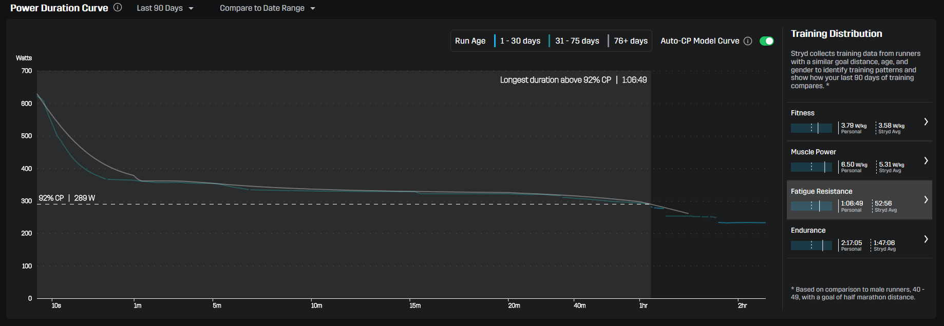
Fatigue Resistance is an interesting metric, because it refers to the competition goal defined in the profile. It measures the longest time you would last just below your competition target (in watts) – according to current data. For a 10 km race, this target is 96% of the CP, for a half marathon 92%. My 289 watts would only last 1:06:49 hours at the moment. I’m afraid I won’t be at the finish line yet ;) But for a 10k, my fatigue resistance at 96% would look quite good. It’s still a bit inconvenient at the moment to jump into the app to change the competition goal, but I’m sure that this is already on Stryd’s roadmap.
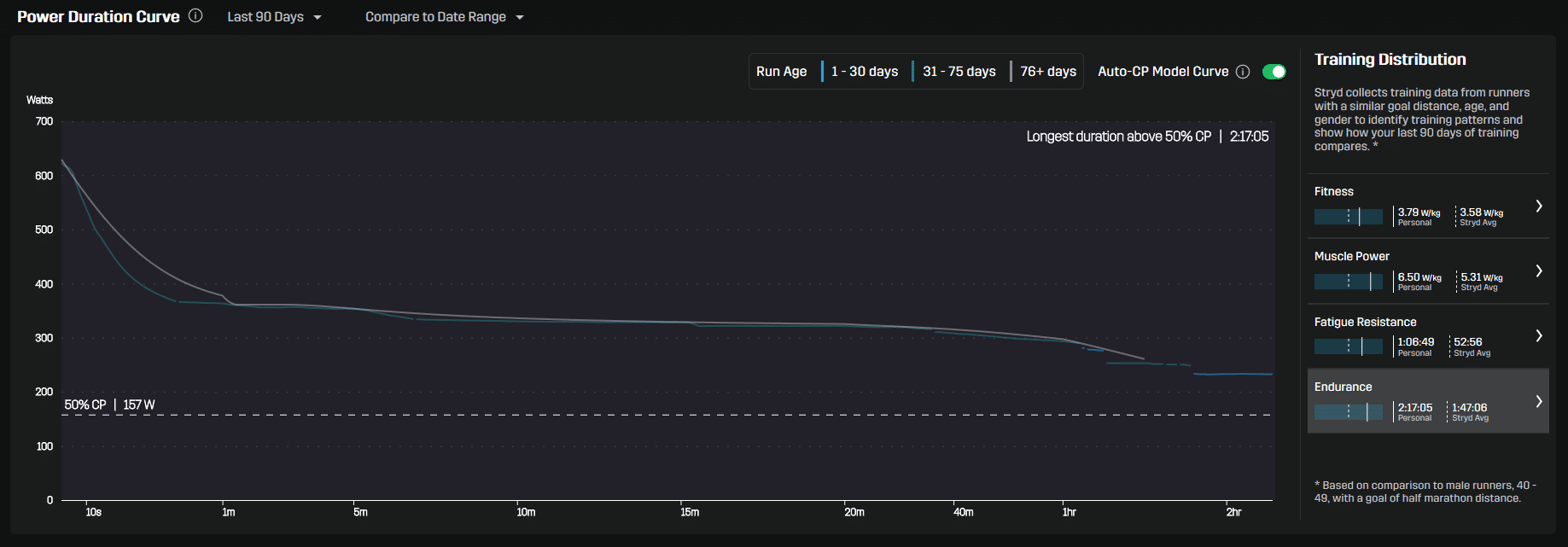
Finally, the endurance is listed. It measures the longest time spent in training above 50% of critical power. So, at the end of the day, it is simply the longest run in the last 90 days that counts. To say it clearly: one single long run three months ago is enough to score here… I would like to see a weighted average being used to get a useful statement.
Conclusion
For me, the new Stryd PowerCenter came unexpectedly and, quite frankly, it really blew me away. Surely there are still a few points here and there that need to be worked on. But I’m very confident that this is exactly what will happen and that the PowerCenter will become a serious analysis platform. I can already find many functions here that were previously only available with paid services (TrainingPeaks / WKO). Some of them are even better solved in the PowerCenter. In any case it is worthwhile to familiarize yourself with the Stryd offer and use the information for your training.

Autor und Betreiber von Harlerunner.de. Läufer seit mehr als zehn Jahren, über 100 Wettkämpfe von 5 km bis Halbmarathon im Gepäck, bisher mehr als 500 Produkte getestet. Kein Labortest — alles kommt aus dem echten Training in und um Coesfeld. Was du hier liest, hat er selbst an den Füßen, am Körper, am Handgelenk oder im Ohr gehabt.
Author and owner of Harlerunner.de. A runner for over ten years, with more than 100 races under his belt – ranging from 5 km to half-marathons – and having tested over 500 products to date. No lab tests – everything is based on real-world training in and around Coesfeld. Everything you read here is something he has personally worn on his feet, on his body, on his wrist or in his ear.

